Recently I did some research to collect data from two different aspects. I chose to do one set on the stock prices over three months time of three different restaurant companies I use the most. The second set of date that I looked at was the number of students enrolled in grades K-12 in Richmond city schools from 2009-2016. I picked this data set because I want to become a teacher and I find it interesting to see how these numbers fluctuate over time.
This first date set looks at the stock prices over 3 months time from Starbucks, Chipotle, and Texas Roadhouse. I picked these three companies because I personally purchase from Starbucks and Chipotle often, and Texas Roadhouse because I work there and their success is important to me as an employee. I thought that Starbucks would be the most valuable because of its millions of stores nation wide and its popularity. However, Chipotle holds the most value out of the three. I was shocked at finding this because recently Chipotle has had a lot of negative views in the media because of its customers becoming sick from the food. With this being said , there was a slight drop in stock prices in late October, but those prices have since bounced back. (Data for research and chart can be found at http://www.nasdaq.com/symbol/txrh/historical, http://www.nasdaq.com/symbol/sbux/historical, and http://www.nasdaq.com/symbol/cmg/historical)
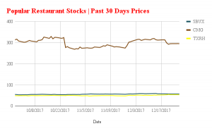
I chose to display the data found on this type of chart because it best shows the large difference of price between Chipotle, and Starbucks and Texas Roadhouse. It also allows those viewing it to see the fluctuation in Chipotles stock prices.
The second set of data I researched was the number of students enrolled in grades K-12 in Richmond, VA schools from 2009-2016. With the demand for college degree’s within the workforce now, I expected to see an increase of student enrollment over this span of time, however, enrollment was at an all-time low in 2013 for this spa of time. From 2009-2013, the number of enrolled students steadily dropped. Since 2013, those number have since slowly risen, but they have not fully returned to the high of over 27,000, that it was in 2009. Looking at the trend the number currently have, I believe that we can continue to see these numbers rise in years to come. (Data for research can be found at https://factfinder.census.gov/faces/tableservices/jsf/pages/productview.xhtml?src=CF)
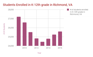
I chose to display the data found on this bar chart because it shows the decline and then rise of student enrollment in schools clearly. The viewer can immediately point out the low of student enrollment as well as the high. This graph is very easy to interpret and understand.