For my data analysis, I decided to pull data from Farmville, Virginia. This interested me because Farmville is a small area that I do not know much about, even though I have attended Longwood University for three years now. And I am considering staying in Prince Edward county to teach, so I am interested in learning more about it.
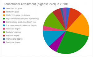
The first data set I found, was the was how far the population of 25 years old and higher went in their education career. I decided to compile the data into a pie chart because I believe that is the easiest way to see the different sections that make up the whole body. The data is out of 8,643 people ages 25 and older, so you can easily see that the biggest chunk is a high school graduate. The smallest chunk is a professional degree. At first glance at this data, I thought the numbers would slowly go down. And while this is the case for some of the data, more people in this age range received a doctorate degree than a professional degree. I am not sure why that is, but it is interesting to note.
Link to data set one: https://factfinder.census.gov/faces/tableservices/jsf/pages/productview.xhtml?src=CF
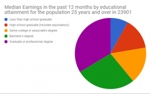
Since we know now how far the population of 25 years and older took their education, I decided to find data on how much money they make in a 12 month span. This data is exactly how I guessed it would be. The people who have attained the higher education receive the most money. For example, people who received a graduate or professional degree, are making more than the people that only received a high school degree. However, I know this is not always the case so there were a few outliers. I was surprised on how close some of the numbers are. For example, a high school degree makes $4,000 less than some college or associates degree.
I decided to use a pie chart for both data sets because it is a clear way to see the differences between sections. It is also easier to see how valuable a college degree is when the data is aligned together in two of the same type of charts.
Link to data set two: https://factfinder.census.gov/faces/tableservices/jsf/pages/productview.xhtml?src=CF
No comments