This is one in a series of beautiful commercials Google airs at the end of each year. The theme is to look back at the “year in search” to show the things that happened throughout. While it is put together really well, it is also an excellent marketing ploy, as people associate these things with Google, and then look to Google the next time they want to find something out.
COMM 340 – 01 Blog Post #12 (Chapter 13)

Game of Thrones is undoubtedly one of the most popular television show actively being created. It’s impact has spread across the globe and created a culture that revolves around the fictional Westeros. There are places where one can pretend to live there, there are games, and pop-up bars all themed around the show. It has certainly made an impact in world of media and more.
COMM 340 Blog Post #11 (Quick Cutting)
Quick cutting has many different effects depending on the type of film it is used in. In a thriller, such as Psycho, quick cutting is used for the ultimate scene following a tense build up. In other action movies, such as Troy, quick cutting is used to show the hectic nature of a fight, as well as to get many angles of the same people.
COMM 340 – 01 Post #10 (Music)
https://www.youtube.com/watch?v=Kkq8a6AV3HM
Music does a lot to movies, television, ads, etc. This ad from Apple is focused entirely on music, as it shows the new “animoji” feature using a singalong to music. In addition to the premise of the new feature, the music also serves to add a fun and exciting atmosphere to Apple and their product.
COMM 340 – 01 Blog Post #9 (Chapter 11)

Shallow depth of field can be used in a variety of ways to focus on specific people and things, whilst also making the background much less important. In this specific example from The Handmaiden’s Tale, the focus is on the two characters, their clothes, and their facial expressions. This both shows that they are the current center of attention, and that the setting is not as important as they are in this specific scene.
COMM 340 – 01 Blog Post #8 (Chapter 10)

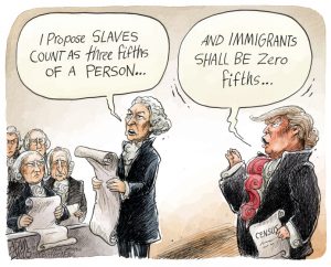
Editorial Cartoons often center around hyperbole and exaggeration for effect. This cartoon shows a hyperbolic representation of Trump’s positions towards immigrants by comparing it to the Founding Father’s position towards African Americans. The effect is to show the reader that Trump is being worse than those who put slavery into law.
COMM 340 – 01 Blog Post #7 (Chapter 9)

Pie charts are a visually stimulating way of introducing information. This statistical infographic shows many parts creating a whole. This one in particular works as the chart itself has clear color difference and clear headings on the way to showing the reader what their “recommended diet” should consist of.
COMM 340 Blog Post #4 (Chapter 5)

This is an example of a stereotype pandering to men. The common conception is that “manly men” drive pickups, disassociating them with women or those who may not be seen as picturesque male. The term phrase “don’t get a hernia” associates the truck with men, thus creating a stereotype in modern media.
Communications 340 – 01 Blog Post #3 (Chapter 3)

Analogical Code inserts an extra meaning or mental comparison to a piece of media. It is often inserted on purpose, but shown to be “accidental” looking. In this ad, there is the image of a man whose “beard” is actually the hair of a woman whom he is embracing. The idea being that the product will make his beard look so good that he will have women around him in this way. It is a clever use of the analogical code leading to extra meaning.
COMMUNICATIONS 340 – 01 POST #2 (CHAPTER 2)

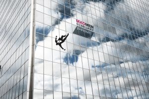
This ad for the show Mad Men depicts the graphic movement of a man falling. While it is a still image, the viewer’s brain allows them to picture it as if he truly was falling. Additionally, the reflective colors off of the building are bright, thus highlighting the black that is the man and the logo.