Data Analysis Project
By Linae Morton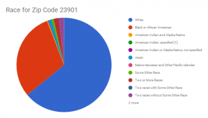
I chose to get data from the area of Farmville. I did this because Farmville is my home and I wanted to know more about its demographics. Specifically, I chose to analyze and clean the race and age data from the 23901 area. The 23901 area consist of 16,399 people. Whites take up the majority of Farmville residents with 10,720 people. Blacks come in second with 5,039 people. All of the other races have no more than 300 people in their category. One race, the Native Hawaiian and other Pacific Islander, has as little as 2 people. I chose to use a pie chart for this date because I was trying to compare parts of a whole. I wanted show how the majority of the people in Farmville compare to the minority in size.
https://factfinder.census.gov/faces/tableservices/jsf/pages/productview.xhtml?src=CF
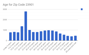
My next graph consisted of the ages for the zip code area of 23901. Farmville consists mostly of people between the ages of 20 and 24 years. This is because it is a college town. However, unlike most college towns, Farmville is the home of two colleges, Longwood and Hampden Sydney. The second leading ages of Farmville residents are 15 to 19 years old. And the third is ages between 25 to 29 years old. I chose to use a bar graph because my main goal was to compare things between different groups. I could have used a pie chart but there are so many values that the pie chart might have looked confusing. So I stuck with the bar graph.
https://factfinder.census.gov/faces/tableservices/jsf/pages/productview.xhtml?src=CF