Data Anaylsis Project
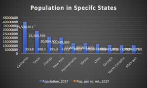
These graphs are from The United States Census in the year 2017. I chose these graphs to show how important population is. The population has grown so much in the past couple of years. In this specific dataset, it has selected a few states and pointed out how many are in different states. As you can tell, you can see that the most popular state is California. You can see the difference of population in each state depending on how many popular a state is. This shows that although there are so many people in California, there is still more room left in Michigan. I chose this type of data chart to show the population and population per square mile in a better form with color.
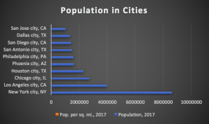
In this dataset, this specifically shows the population in the major cities in The United States. As you can tell, New York City is one of the most populated cities compared to any other city in The United States. This shows where a lot of people want to go and visit. Although these cities are large, this shows the importance of keeping count of the population.
Resource:
https://www.census.gov/popclock/?#
Recent Comments