
My data sets aim to compare the 2016 school enrollment throughout all grade levels in two Virginia cities: Farmville and Leesburg. I chose this topic because even though I am not studying to become a teacher anymore, I still remain passionate about the education that children should be receiving in our current times. The first step to effective learning is held responsible by the student and parents, having the child attend school. I thought it would be fascinating to analyze the differences between the city in which I currently live, Farmville, and the city I’ve grown up in, Leesburg.
These are two very different cities, regarding their socioeconomic status and consequently, the quality of their school systems. I wanted to see if these factors played a role in the students’ ability/willingness to be enrolled in schools. Of course, Leesburg has a considerably larger population than Farmville, which will also have an effect on on the data retrieved. I also wanted to focus on the comparisons between public and private school enrollment for each grade level range. These aspects influenced my decisions on chart types.
My first data set depicts school enrollment in Farmville, VA. I chose the most recent version of this data- the 2016 census. I first began by observing the original data set to decide what I wanted to extract for my own purposes. I ended up removing a majority of subjects, including the male and female conditions for each grade level range, as well as the age ranges. I also removed the percentages from each set, and the corresponding margins of error.
| Subject | Total | Public school | Private school |
| Nursery School/Preschool | 176 | 147 | 29 |
| Kindergarten | 104 | 93 | 11 |
| Elementary School: Grades 1-4 | 598 | 499 | 99 |
| Elementary/Middle School: Grades 5-8 | 653 | 424 | 229 |
| High School: Grades 9-12 | 495 | 379 | 116 |
| College: Undergraduate | 4,177 | 3,141 | 1,036 |
| College: Graduate/Professional | 207 | 155 | 52 |
Once this was completed, I used my revised data table to create a stacked column bar chart, labelling my axes and legend. This chart allows me to compare public and private school enrollment in each grade range group. I then formed a simple pie chart, to compare total enrollment among each grade level, as if they each were parts of an overall whole.
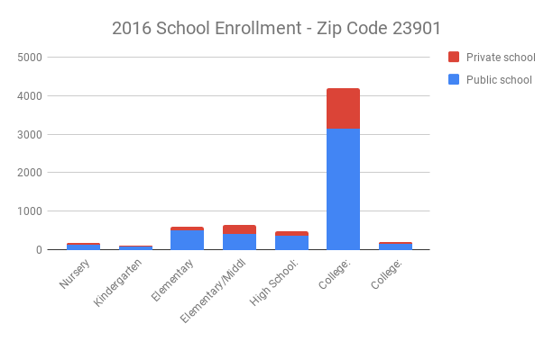
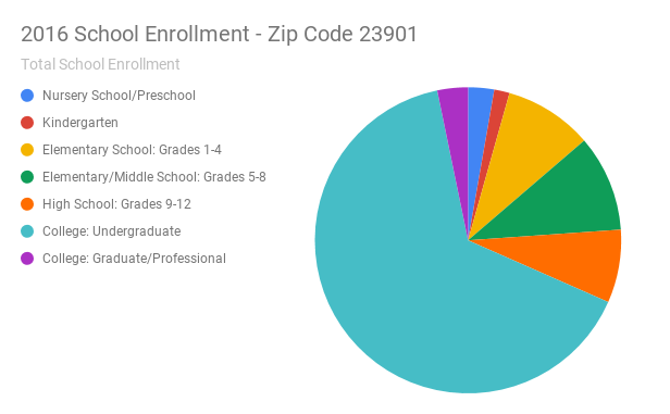
After analyzing my bar chart, I wasn’t all that surprised by my findings. Public school seems to triumph over private schools in this area. I did notice that private school enrollment for undergraduate students seemed significantly larger than other group comparisons. This took me a while to figure out. Eventually, I realized that this two-college town includes both a public university (Longwood) and a private college (Hampden Sydney). Sydney’s student population is approximately one fifth of Longwood’s population, so the depiction makes logical sense. Looking at the pie chart, I was surprised to see the dramatic effect that our two-college town has on the total school enrollment, as it dominates over half of the chart. It can lead me to asking many more questions concerning the demographics of this area. Overall, I was intrigued by this data collection, which had motivated me to claim my second data set as school enrollment for my hometown, Leesburg, VA.
| Subject | Total | Public school | Private school |
| Nursery School/Preschool | 1,147 | 270 | 877 |
| Kindergarten | 726 | 615 | 111 |
| Elementary School: Grades 1-4 | 4,226 | 3,887 | 339 |
| Elementary/Middle School: Grades 5-8 | 3,299 | 3,097 | 202 |
| High School: Grades 9-12 | 3,290 | 3,167 | 123 |
| College: Undergraduate | 2,079 | 1,545 | 534 |
| College: Graduate/Professional | 918 | 518 | 400 |
Leesburg is located in a county well-known for its excellent school systems, Loudoun County. I chose this next data set to form an even deeper comparison with the findings in Leesburg to what I have collected from Farmville. Each condition remains the same, including the census date and the subjects/sets that occur in the tables. I performed the same exact procedure as I did for the previous data, in respect to cleaning it and transferring it over to the two types of graphs, stacked bar chart and pie chart. I even used the same colors so that it would be easier for me to compare the visuals.
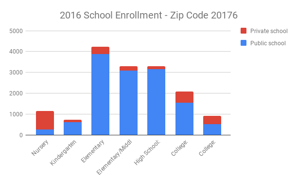
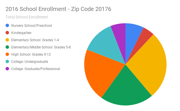
The outcome of my bar chart for the Leesburg data set was essentially how I had predicted. Since a majority of families here have a steady income, they are able to afford Montessori schools and other private education settings for their children. This is also why they are so popular at the preschool age, showing three-fourths of that group as red. But as the groups continue, private schooling declines- which I was also a bit surprised with for this area. I was expecting to see the primary and secondary levels of schooling as the largest of the rest, which is shown in the pie chart. The yellow, green, and orange “slices” depict that enrollment is very similar throughout grades 1-12.
After analyzing the charts from both data sets, I was finally able to compare information from both zip codes. Only then was I able to realize how much lower school enrollment was in Farmville than Leesburg. I also noticed that Leesburg’s data is more spread out, resembling a normal curve. Farmville’s numbers are definitely more scattered. There are countless variables that can be considered for these differences in data sets. However, it was still very interesting to surf around for this authentic information, and make customize it into a format of my choosing.
Links to original sources:
Farmville data set
https://factfinder.census.gov/faces/tableservices/jsf/pages/productview.xhtml?src=CF
Leesburg data set
https://factfinder.census.gov/faces/tableservices/jsf/pages/productview.xhtml?src=CF