For my Data Analysis Project, I first started looking at different data sets on American Factfinder, under the state of Virginia. I knew I wanted to do something that involved education. I compared the different data sets under the education tab but what caught my eye was something that is current to me. College degrees, earnings with your degree, and gender.
The first chart I have is a bar graph that is based on population of the number of males’ versus females that have earned a bachelor’s degree or higher. The blue bar shows the total number of people that were surveyed in that age range. The two bars next to the blue sort out from the total in that age range, how many were male and how many were female. I thought this was interesting because I was curious to see if gender has any play on who continues on to get their degree. There are always those perceptions that females are more mature than males and I wondered if maturity would be the key factor why for majority of the age ranges females continue on to get their degree compared to males.
The second chart is a pie graph that displays the median earnings by gender for the last 12 months. This data relates to my first chart because from all the data I organized and cleaned it to just display the people who have earned a bachelor’s degree or higher.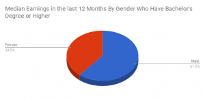
The interesting conclusion to both of these charts, the first one displays the majority of females end with their bachelor’s degree or higher but in the second chart you can see that from the last 12 months in the state of Virginia, males have earned more than females on a median scale.
Data Set One: https://factfinder.census.gov/faces/tableservices/jsf/pages/productview.xhtml?src=CF
Data Set Two: https://factfinder.census.gov/faces/tableservices/jsf/pages/productview.xhtml?src=CF