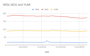
In the first data set, I decided to use a line chart to show the stock prices of food companies within a month. The food places include: Wendy’s, McDonald’s and Taco Bell (YUM!). In America, fast food restaurants are extremely popular, and an easy target to spend money. There are many research papers, articles and documentaries on fast food restaurants in the U.S. I chose three places that are near my home to conduct my chart. A line chart works best, because it visually shows the stock company’s prices from greatest to least. Specifically, it shows the close mark, which is the period at the end of the trading season or the closing price.
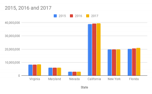
After graduation, I plan to move to a different state to teach elementary students, so I decided to analyze states’ estimated population between the years 2015-2017. Although I prefer to teach in rural areas, population tends to be greater in the city. Additionally, population is important because there will be more schools available that I can apply to. I chose six states in which I want to possibly teach, and used a bar graph chart to clean the data. This chart works best, because it is organized and one can easily understand the meaning of the chart. The population estimations show that California’s population was the greatest out of the six states. The links to both graphs is below, and shows the estimated population for all 50 states.
https://www.nasdaq.com/symbol/wen/historical
https://factfinder.census.gov/faces/tableservices/jsf/pages/productview.xhtml?pid=PEP_2017_PEPANNRES&src=pt
No comments