Infographic

The Infographic breaking down the different responses I received in a poll
The data that went into the above chart

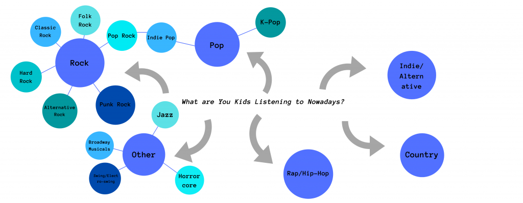
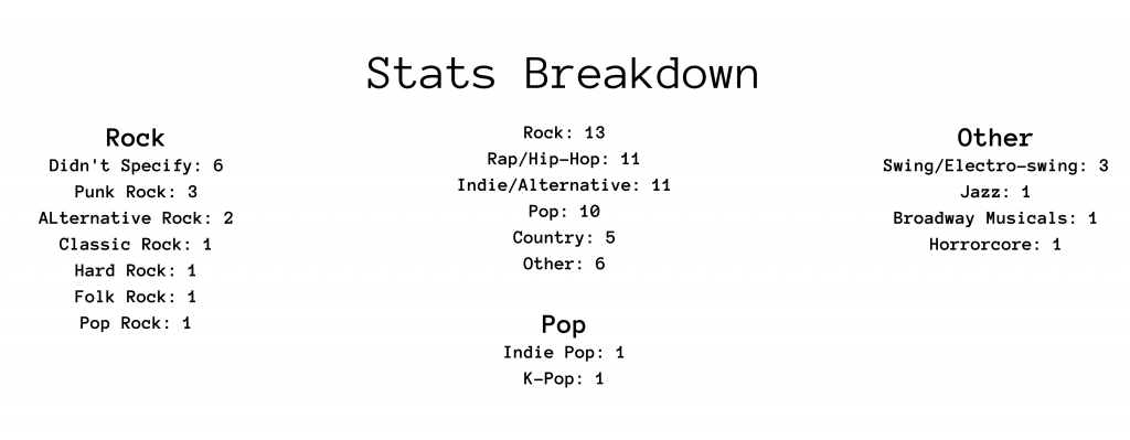
My topic for this infographic was asking freshman students around wheeler what their favorite music genre was. I then recorded it and mapped out the answers according to how specific they were.

I think my insistence on using a lot of text in the first project did not pay off in the long run. Although it worked for that situation, I seriously had trouble once I had to to get rid of text. My first draft was supremely unpopular and I was not looking forward to redoing my whole project in two days. Thankfully, I pulled it off in what my teacher described as a “hail mary.” I would say that is accurate. Although I personally enjoy reading lots of text in my infographics, I learned I need to keep audience in mind. I wasn’t making it for me, I was making it for others. I think the second draft is objectively better than the first. More than anything I learned how important a good visual representation of data can be. It can make all the difference in how your audience receives something. My old draft had the same colors and data as this one, but it was far better. And yet, this improvement was not found in making it more complex or adding more parts, but rather simplifying and shortening.

I chose this particular blueish-green color palette because of my white background. They clashed least and meant I could put less work into the background and text color. I had the genres where people specified an answer on one side, and where they didn’t on the other to provide a semblance of symmetry. The size of the circles kind of lines up with the data but it was hard to make it perfect because of the size constraints of the template I was working in. The font was chosen for its lack of seriousness and sophistication which I thought fit this topic.

Interrogating an interface (MLK letter)

I found the process of reformatting Dr. King’s Letter from Birmingham Jail into a modern form to be an interesting one. I can’t say I’ve ever done a project of this type before and I found the process a bit daunting at first. I primarily work within text, and being challenged to make a more visual depiction of the text was hard. I think for this project in particular I found a nice middle ground between making something visual and sticking to my comfort zone. Facebook is the social media that contains the most text so I think I made the right call in using it.

Next, I want to get into the nitty-gritty of why and how i achieved certain objectives. I pretty heavily target Pathos for this post as I feel an issue like racism is most effectively discussed in emotional terms. I do use portions of his letter that discuss his credentials as a pastor for a bit of Ethos. My thought process there was that southern evangelical and clergymen, his primary target, would be more willing to listen to him if they had something they could relate to. My use of, “I AM IN BIRMINGHAM BECAUSE INJUSTICE IS HERE,” had multiple facets. I wanted to break up the monotony that comes from large blocks of text by interjecting moments of intensity. I also wanted to establish a consistent pace as the phrase is used to break up the piece into sections.

So why transform it at all? Even though I personally don’t think any genre will outdo the simple elegance of his letter, I do think that moving it into a Facebook format has advantages. It does allow for the use of images, giving a more concrete foundation for words to paint, but it also has to go into less depth. A letter primes the reader to expect a lot of text, but any other format forces simplification and a loss of content and context.

I learned a few things. First, people really don’t like reading nowadays. The more efficiently you can visually communicate an idea the better off you’ll be. At least, in a social media setting this holds true. I learned a fair bit about rhetoric and rhetorical devices, but more than that I learned how to effectively implement them. It’s to be able to put ideas into practice. Although this project definitely started me on the right track, I wouldn’t really learn the power of visual devices until much later.