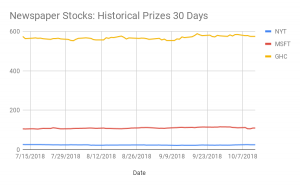
I chose the New York Times, Washington Post, and the Wall Street Journal to compare their stocks. For each data set I chose the recent three months of the stock period, from July 7, 2018 to October 12, 2018. I chose to compare the ‘close’ period in each stock company. The close period means the end of the trading session or the closing price. I wanted to compare the closing price because I wanted to know how each company did at the end of the trading session. I wanted to know how well the companies did.
I chose to do a line chart because they are easier to see the changes over small periods of time. In a line chart you can see the little changes that the companies might make. It shows how well the Washington Post did at the closing period. It shows the New York Times staying relatively the same but the Washington Post moved up and down a lot. The blue line is the New York Times. Their stock tinker is NYT. The red line is the Wall Street Journal, which was bought by Microsoft Corporation. The Wall Street Journal stock tinker is MSFT. The orange line is the Washington Post, which was bought by Graham Holding Company. The stock tinker is GHC.
I chose to compare newspaper companies because I wanted to see how well they are doing in today’s society. Newspapers are becoming digital which means that they have to change. I was curious to see if some of the newspaper companies were able to stay afloat and become digital.
https://docs.google.com/spreadsheets/d/1qt5qcfPzN6RdEEmszg98kX-zCObaQt-I_4ujPKXFQAU/edit?usp=sharing