
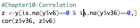
RStudio
1. Open SPSS
2. Use two continuous variables, recode variables if needed
- E.g., v6 = parent engagement (1-10 scale); v36 = income (tax brackets)
3. Type in the following syntax
- z <-y[is.na(y$v6)==0 & is.na(y$v36)==0,]
- cor(z$v36, z$v6)
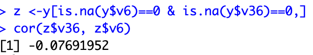
4. Interpret findings
- Correlation coefficient = -.0769
- There is a weak, negative correlation between parent engagement and household income.
SPSS
1. Open SPSS
2. Analyze>Correlate>Bivariate
3. Place two continuous variables into ‘Variables’ box
- E.g., v6 & v7
- v6= parent engagement (1-10 scale); v7 = family enjoyment (1-10 scale)
4. Ensure Pearson, two-tailed, and Flag significant correlations boxes are checked under ‘Correlation Coefficients’
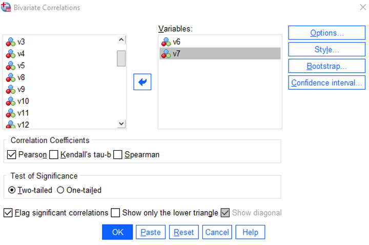
5. Click OK
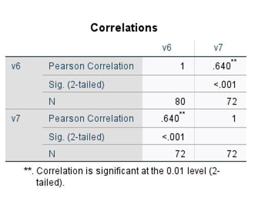
6. Interpret findings
- There is a strong, positive correlation between parent engagement and family enjoyment.
7. If wanting to make a line graph…
- Go to Graphs>Chart Builder
- Drag line graph up
- Add variables into x and y axis’s respectively