I have chosen to perform an ideological criticism on six Nicholas Sparks film posters. These advertisements are for The Notebook, Nights in Rodanthe, The Last Song, The Lucky One, Safe Haven, and The Best of Me.
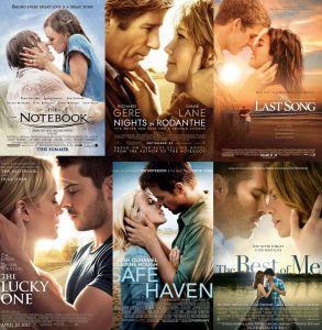
Presented elements in these posters include heterosexual, Caucasian couples kissing outdoors, the short introductory sentences that indicate the basic ideas behind the films, and the complementary nature of their clothing colors to the backgrounds behind them. Suggested elements include conforming to stereotypes about gender and sexuality, focus on style and aesthetic even in intimate moments, exclusion of people of color/other sexualities from plots (and thus, a lack of importance regarding their relationships), and over-the-top depictions of love.
These artifacts each suggest that love between opposite-sex couples of the same race is a good thing. By excluding people of color and other sexualities, the film posters imply that these relationships do not deserve equal representation in popular media. Additionally, the centered focus on the couples in near-kissing poses ask audiences not to question the films’ lack of representation. These qualities present a problematic ideology that focuses on the hegemony of one type of couple over all others.
I love how you dive into not just the stories, but the choice in advertising the covers of the novels/the movie adaptations advertisements as well. I also enjoy your discussion about the problems of the ideology that your artifacts create.
There’s clearly a pattern shown here that goes beyond simply a theme. Do you think the designers’ ideology is unconscious or done on purpose?
Hi Karen!
This is actually really interesting because I never noticed how the posters all have basically the exact same image and elements. Do you think that the ideology of these posters is discouraging relationships between people of different races, sexuality or ages? Maybe the poster/movie designers and writers are doing this unconsciously or maybe it is being done on purpose? This is just really intriguing to me. Also, how do you think that audiences are reacting to the exclusion of others in these movies/posters?
Do you think there is a way for these films to better represent other people? Seeing all of these posters put together is the first time I’ve realized how similar they all are. Do you think there could also be a lack of creativity from the photographers?