This English course was Digital Writing, an introduction into Forms and Genres. Throughout the semester, we discussed and defined genre in the digital context, learned specific nuances of particular genres, and used genres to convey messages. With each project, we discussed the use of color, space, size, arrangement, and font in the effort of making the most digestible pieces of media. I learned a lot about how simple color changes can effect the functionality of an image. While doing so, I learned more about myself and the delivery of information. Below, I will be discussing the two projects we completed and what I learned from them, besides all the technical jargon. I focus less on the technical information I learned in the class and more on the overarching lessons.
Interrogating an Interface
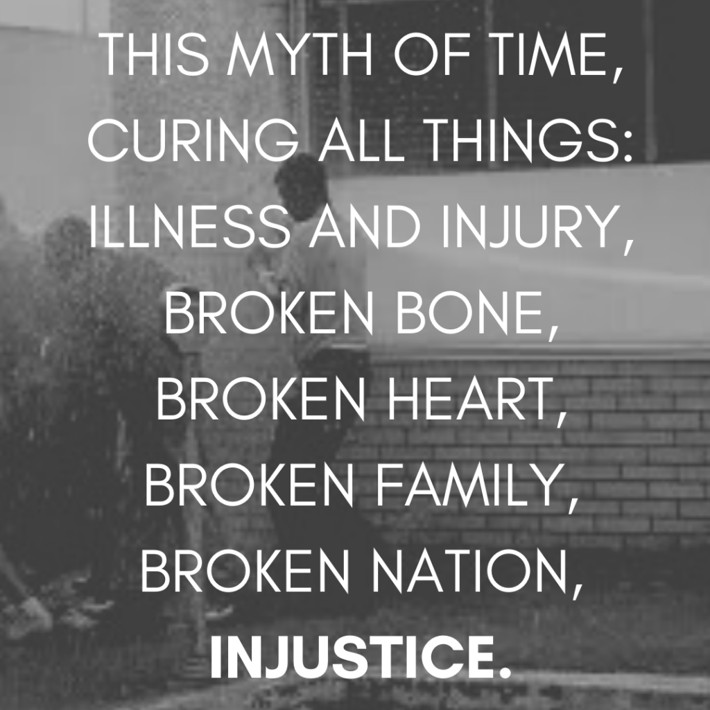
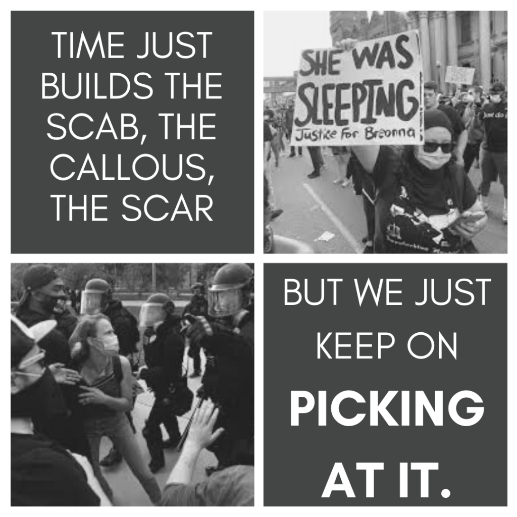
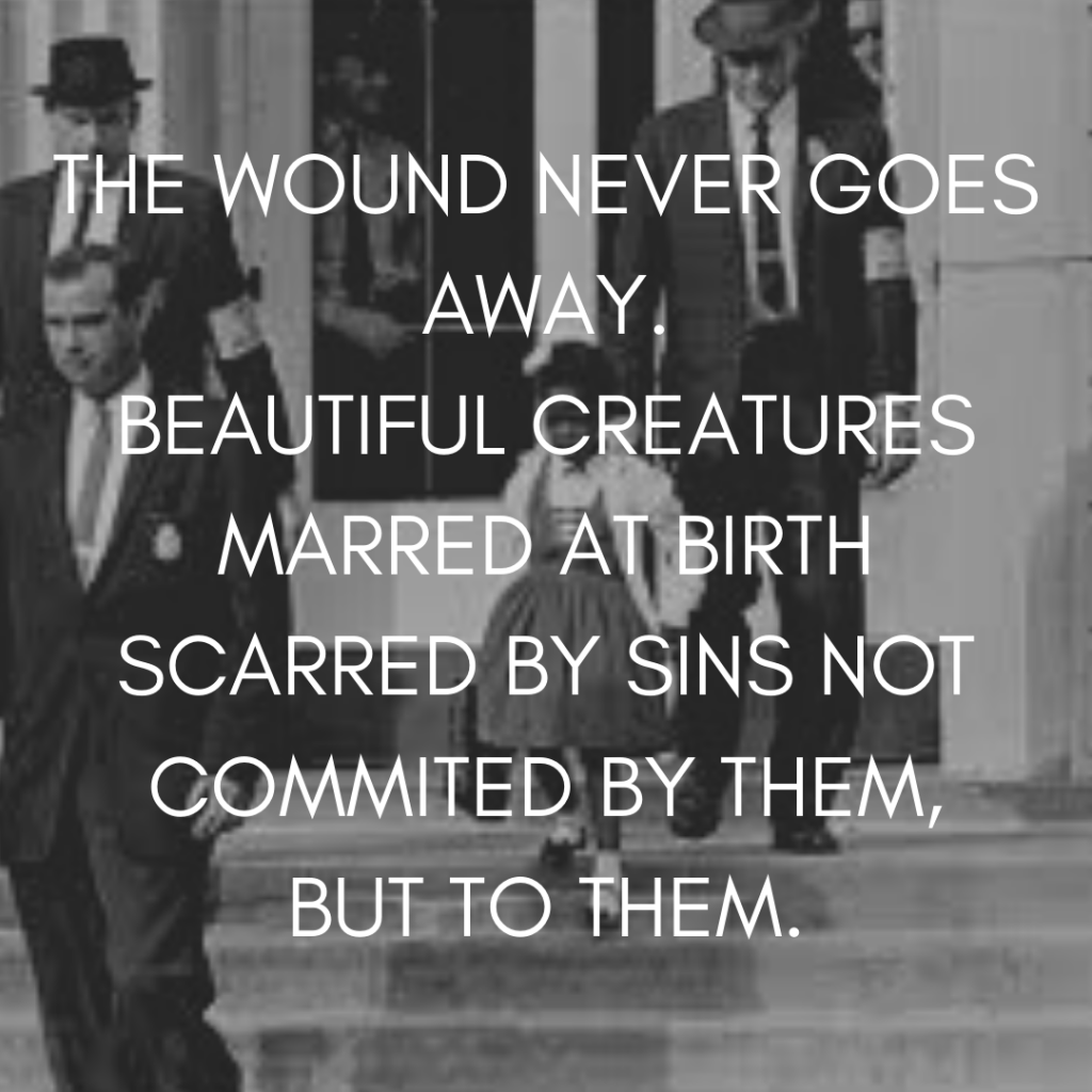
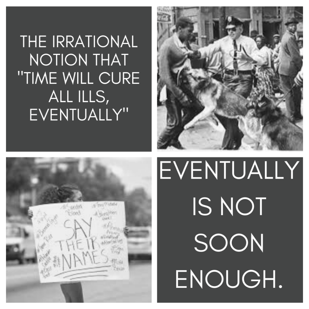
Martin Luther King Jr.’s ‘Letter from Birmingham Jail’ is a powerful piece all on it’s own. It targets the moderates of the time and call them to look deeper instead of just accepting things as they are. The targeted moderates, especially white Christian moderates, who believed the non-violent protests were out of line, too aggressive and not helpful, were the people specifically telling MLK and the Civil Rights movement to slow down and “wait” for the “right time” or for “time to fix everything.” Transposing the letter into a poem and planned Instagram post with pictures and a video of the poem performed, suggests that the message still rings true today. The focus of my poem came from a simple sentence MLK wrote, “Time is neutral.” I chose to specifically focus on the quote and tackle the idea that time does not actually fix anything if we just wait and let it run its course. Making this message heard by people in my generation was the goal, and this genre will reach the younger moderates, who have all grown up being taught that time fixed everything and we have nothing to fix anymore.
Through this project, I learned that flowery words and bright images have their time and their place, but blunt, bold statements and solemn images can spread a message just as fast. I learned to look deeper and do something with what I’m being told, to be the change we keep waiting on time to bring. I learned that with simple editing, images of today look terrifyingly similar to images of the past and that waiting didn’t fix anything. This project opened my eyes to changing focus, picking one message to spread can incidentally spread others. Writing 100 pages of flowing words means nothing if your message gets lost, but a 1 page poem can mean everything if heard by the right ears.


Infographic Project
Unlike the first project, our final project was completely our own. We were no longer starting with someone else’s work and transferring it to the digital world, but we were compiling data and information on topics that we came up with and presented in our own manner. I chose to tackle common myths and misconceptions in people’s understanding of asexuality as a sexual orientation. I ran into a wall with finding data and eventually created my own survey and sent it out to a few Longwood classes and put it on several social media until I got roughly 80 responses. The design of the infographic really helped me understand the importance of color. As noticed in the infographic below, the colors are uniform except for the Common Misconceptions section, where I used red and blue. The whole infographic is thrown off because of the color change. Another technical thing I learned is my habit for world dumping doesn’t make information easily digestible.
Besides the technical aspects of design, I also learned a lot about how information and opinions connect to each other. While I only used the results of my survey at face value, a lot of the results had multiple connections. For example, if someone answered “true” to a specific question, they answered “true” to majority of the other true or false questions. I also learned that I can do more than I think. I started the project with an idea of making all the graphs look like cakes, but none of the software I had could make what I had in mind. Instead, I made all of the stacked cakes with a lot of cropping and snipping tools. Sure, it’s not as clean as I would like, and I was unable to change the Common Misconceptions cake by the time I had to finish the project, but I did better than I thought I would.
The infographic below can be viewed more closely here.