Data Analysis Project
December 28th, 2017
For this project, I decided to look at the national statistics of males and females with or without disabilities.
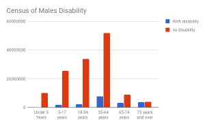
The above chart looks at the different ages of males and whether or not they have a disability. The orange color represents no disability, while the blue color represents a disability. The chart shows that the number of males with a disability increases until about 64 years, then the numbers fall. But in relation to the number of people, the amount of males with disabilities actually increases. The chart also shows a dramatic decrease of the total number of males after 64 years old. 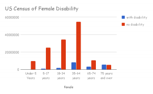
The above chart shows us the number of females with or without disabilities. It looks like the males one, but it is noticeable that there are less females with a disability than males. The chart follows the same trends as the male chart.
I chose to look at males and females with disabilities, because my sister lives with a disability and I wanted to know if it was more common in men or women. By the looks of the data, it is about the same in men and women. I chose a bar graph because it easily shows how the two differ as a gender whether or not they have a disability.
This Links to the charts and data sets: https://docs.google.com/spreadsheets/d/1Mk7LGdK9RemZWB8lgT_LI5dxtd3krHMAZD1jsgftaIE/edit?usp=sharing
This links to the data set from the US Census: https://factfinder.census.gov/faces/tableservices/jsf/pages/productview.xhtml?pid=ACS_16_5YR_B18101&prodType=table