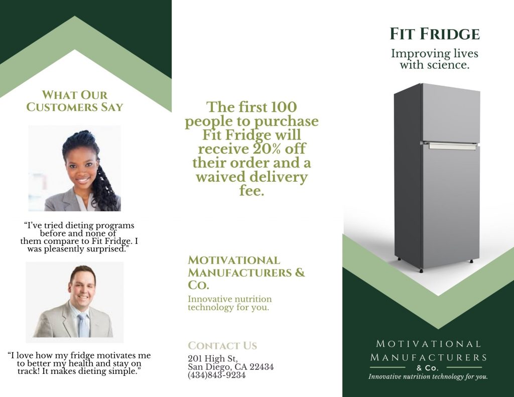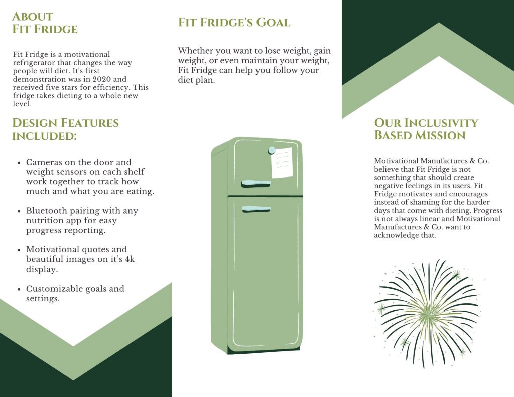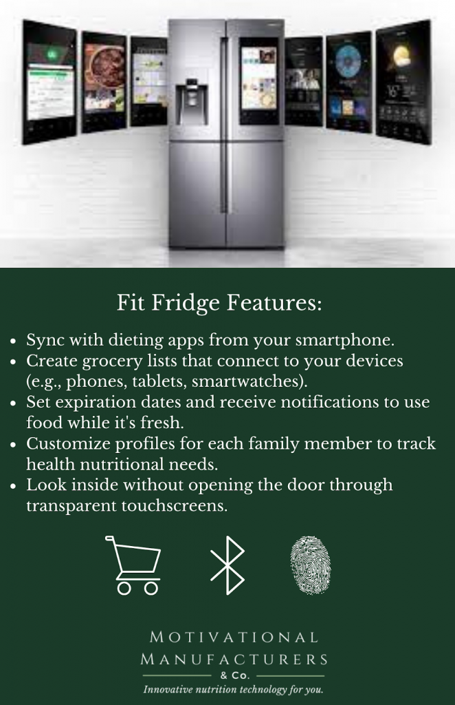
My team of Grace Girdley, Payten Bovat, and myself collaborated to create a brochure and a flyer to promote a hypothetical product called Fit Fridge. We worked together using Canva to produce these promotional materials. The trifold brochure, in particular, implements AIDA (Attention, Interest, Desire, and Action) and both documents were designed with CRAP (Contrast, Repetition, Alignment, and Proximity) in mind. Our brochure opens with a professional image of the product with basic information on it to draw readers in, or catch their attention. The inside provides further information to create interest as well as desire and the back presents our company’s contact information in hopes that readers will buy our product, or take action. Contrast was utilized by using a white background with green accents on top. Repetition creates a cohesive look with the consistent use of the same fonts and colors. The left alignment of the text also aids in the cohesiveness of the document. Proximity is reflected in how the headers for a corresponding block of text is in closer proximity to one another. Our flyer, on the other hand, was a bit too small of a document to fully implement AIDA. However, we chose to focus on the features of the product as well as a high-tech image of it. We also used the same colors as was used in the brochure and used bullet points to make the information easy to read. With my partners, we were able to successfully create these hypothetical promotional materials by applying rhetorical strategies and design principles.