Post #4 – Ideological Criticism and Peer Response

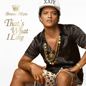
For my artifact, I decided to use the album cover for Bruno Mars’ latest album 24K Magic, but more specifically for one of his hit songs ‘That’s What I Like’.
The album is simple enough without anything to flashy besides the ladies man himself – sporting clothes circa 80’s-90’s, an open-sitting position, a small but inviting smile, and some rather showy but tasteful gold jewelry.
The album text itself has a faint highlight band, indicating that the text color should be gold as well, and all of the colors in general are neutral but stately colors of black, white, and gold (there’s actually no other color besides those)!
These are all decisions he made when he chose to have this image represent the single That’s What I Like.
Black and White are straightforward colors that are bold, and figuratively speaking, it is either one thing or the other; yes or no or this or that.
Gold is an eye-catching color, so more than likely, he has a distinct taste for the expensive/high-quality since he dons it all over. Plus, looking at the placement of the gold, it might be his intention for the audience’s direct attention to be attracted in the general location; it might be around his neck, but it also emphasizes his chest. He may be wearing gold rings, but his hands are placed around his inner thigh, drawing our focus to that region.
His posture is rather open and exudes confidence since he does not feel the need to close himself as if to protect himself.
His facial expression is also welcoming since a smile shows not only happiness but comfort and something that is pleasing.
Overall, the picture exudes the sense that Bruno Mars has his eye on on something that he likes, and even without the song name to title the picture, I think we can all figure it out.
But the song is a better way to confirm it and never gets old ;P

You did a great job of exploring the suggested elements that are represented in the picture and that correlate with the presented element of the title. I think maybe an ideology of this would be societies fascination with material items.
This is an interesting view of his album cover. Do you think that in this case the “less is more” works for him here? Bruno Mars is one of the best in the game today, and he definitely has input on what goes out with his name on it.
I think you selection is unique which makes it great in itself. It’s interesting to infer how Bruno Mars made his choice in his album cover. I personally am attracted to simpler things, rather than flashy, over the top, therefore I find Bruno Mar’s take on his album respectable. This was very interesting to read about and easy to agree with!
Hey Abby,
This is a super interesting thing to write on for ideological crit, I would have never thought to write on an album cover. For me, it would have been helpful if you separated this information into suggested and presented elements. However, I can see what you’re trying to say about both. I think that you do a great job of describing what the album looks like, and furthering that analysis by stating what that means for the audience. I think if you were to write about this in your essay #2 it would be helpful to know what his previous album covers have looked like, and what this means for the audience/what changes have been made. Overall, I think this could develop into a good idea for essay #2, I think if you expand your article a little bit you could have a lot to discuss!
-Charleigh