All posts by Jessica Groff

Post #11: Progress Report – Client Project

As a group we have came up with a game plan to create a facebook, website, business cards, and other marketing materials for a photographer’s personal business. We have discussed designs and looked into ideas from other photographers’ marketing materials. We discussed the way in which we want to portray the photographer so that his materials appear to be professional and clean cut as his business is growing.

Tuesday, Nov. 17 (Meet to divide up work more so than we have already, decide what to have ready for next meeting)

Thursday, Nov. 19 (Meet to decide what to have ready for Monday, ask final questions for client opinion and suggestions, be ready and prepared to bring in successful work to Monday’s meeting)

-Possibly meet over weekend if necessary, otherwise work independently while staying in touch via text and google doc.

Monday, Nov. 23 (Meet to compare and compile final drafts and work out how we will present)

Tuesday, Nov. 24 (Usability testing- have drafts complete for presentation. Final edits to be made after this date)

I am personally going to work on the photographer’s media presence as well as any of the written marketing materials to ensure that they come off as professional as possible and are formatted correctly. I will also collaborate with Dana and Kayla to make sure our efforts are consistent.

Post #10: Prewriting for Case Study and Kinross/Williams

Often in the twenty first century with the discovery of technology people are becoming consumed in the technology, focusing more on that then human interaction. Two rhetors set out to edit photographs and present them in a way that is striking to those people who seem to be so infatuated with the newest craze of smart phones.

The use of visual rhetoric through these photographs is a prominent element in persuading the audience to see the message that smart phones are taking over our lives and even ruining our relationships and social interactions with others. In the two articles that I am analyzing the rhetors use the same tactic of removing part of the photograph to make their point clear, but they take two very different approaches to this.

In the first article, the rhetor chooses to just remove the cellphones from the pictures. The result is images of people looking bored or dissatisfied, staring off into space because they do not have their phones to distract them from the real life social situations that they should be interacting in.

http://www.theguardian.com/artanddesign/gallery/2015/oct/15/life-without-smartphones-in-pictures

In the second article, the rhetor chooses to take a similar approach by removing an important element of the image. These photographs show the peoples arms with their phones in their hands, but are missing the rest of their body. Perhaps this rhetor is trying to make a similar point by saying that even though our bodies may be physically present, all that matters is our smart phones. Going into social situations people are more represented by their phone that they are playing on the whole time than the people right beside them that they could be interacting with.

kamil-kotarba-hide-seek

In our reading by Kinross, one quote that really resonated with me was “the choice of typeface is often telling, in that it indicates the ideas and beliefs that inform the process of design” (377). I think this can relate to the articles I am analyzing because even though there are not many words with the photographs, the words that are there are important and the typeface that they are in gives a certain meaning in the message that the rhetor is trying to get across.

Post #9: Case Study Proposal and Doumont/Williams

I plan on analyzing two articles that have pictures that show the realities of texting and the prominence of it in today’s society. One article shows the realities of texting by taking the cellphones out of the images and leaving the people with their empty hands sitting in the social  situation looking bored and out of place.

http://www.theguardian.com/artanddesign/gallery/2015/oct/15/life-without-smartphones-in-pictures

The other shows the images of the arms with the phone in the hand, not showing the rest of the body. The arms are in public places where you would expect to see a number of people but instead see the arms isolated

http://www.wired.com/2015/10/kamil-kotarba-hide-seek/#slide-1


I can analyze the semiotics: specificity of audience the rhetor is using the images show the audience something that they don’t see they are doing. It shows how technology as the primary source of communication is taking away from human interaction/ social cues.

Post #8: The Visual Rhetoric of Communication

Sturken “The Wall, the Screen, and the Image.”

One term that Sturken seemed to focus on a lot is the idea of the screen. “A screen is a surface that is projected upon; it is also an object that hides something from view, that shelters or protects.” according to Sturken. The Vietnam Veteran’s Memorial is a great representation of a screen, it allows the audience to project their feelings and their role in the memorial being presented.  The idea of the screen allows for the people surrounding the memorial to interpret the memorial in whatever way they wish by giving them essentially a blank space to view and project their feelings upon.

There is a significant amount of focus on distinguishing a memorial from a monument in Sturken’s article. She says that “memorials tend to emphasize specific texts or lists of the dead, whereas monuments are usually anonymous”. Basically, memorials usually focus on commemorating something, while monuments seem to focus more on an overall event.

The purposes of the memorial and the sculpture are to allow those who wish to come remember, experience, and engage in the feelings that they once felt or that their fellow Americans once felt. It is an opportunity to see and feel how people felt who were directly influenced by the events of the war. People who visit the monument are even encouraged to leave something at the monument in remembrance, allowing them to participate in their own way, another example of the screen idea.


Post #7: Visual Arguments

1) Birdsell & Groarke “Toward a Theory of Visual Argument”

Birdsell and Groarke talked a lot about the context of an image and how important it could be. In the below image, you see an advertisement for Paris. The context would be knowing that the Eiffel Tower is in Paris, if one did not know this the image would make no sense. Audience members may wonder why the “A” is capitalized and in a different color. Proving their point that without context it is hard to interpret or understand an image and what it is supposed to portray.

2) Blair “The Possibility and Actuality of Visual Arguments”

What stood out to me the most about Blair’s argument is that even though arguments can be visual, they really are not that different from verbal arguments. Blair said that when using visuals in an argument, they are often there to add clarity for the verbal argument. Arguments can use very little verbal text, because the visual is often what evokes the emotion. Because it is often hard to know what the artist was exactly trying to argue, text is helpful in guiding interpretation for the audience.

For a comparison, this ad is for the World Wildlife Fund. This ad has no apparent text, just an image of a giraffe made out of coins. An audience would  see this image and think that it is trying to get them to donate money because it would go to saving an animal like a giraffe. This could be interpreted in this way by the audience with just the visual, and in a more effective way then if it were just to say “donate to save the giraffes” or something along those lines.

This image proves Blair’s point that yes an argument and message can be portrayed with just text , but the image is often helpful when it comes to interpretation. With looking just at the image the audience gets the premises of the run down environment of the giraffe, and may see the coins as a solution to helping improve the environment and the lifestyle of the giraffe. Images often help to evoke more emotion than just text would when it comes to getting an arugment across.

Post #6: Rhetoric of the Image

According to The Rhetoric of the Image, images are rhetorical. There are different “signs” that are communicated through visual artifacts. These signs come together to form a coherent whole with rhetorical meaning which portrays values, culture, and much more. A rhetorical analysis also shows that there may be multiple meanings to a visual artifact. Barthes believes that there is always a linguistic message, even in an image. He also says that there is also always a not so obvious symbolic or literal image within an image, a hidden meaning you could say. Basically, a visual artifact can be the same as any other rhetorical object and can be analyzed as such.

I agree with the fact that Barthes believes images and visual artifacts to be rhetorical. As a rhetoric and professional writing student, I believe that anything can be rhetorical and can be rhetorically analyzed. I enjoyed seeing that a scholar also agrees with me on this point.

Post #5: To what extent is visual art rhetorical? (LCVA Trip)

After viewing the art at the LCVA in Farmville, I feel that art is something that can be rhetorical.

IMG_20150910_115707158

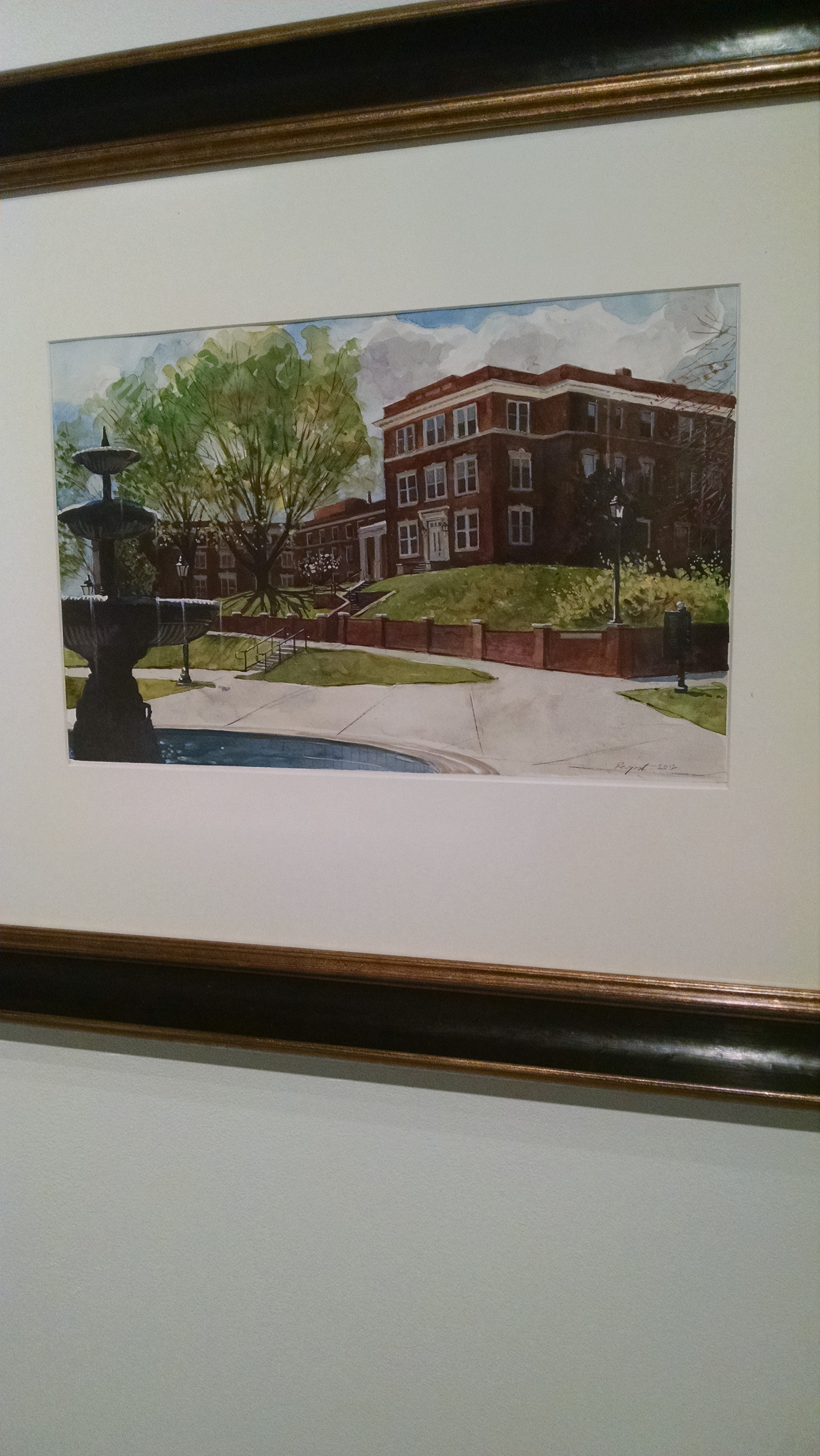
The Cunninghams from Beale Plaza at Longwood University by Christopher M. Register is a painting I believe is rhetorical especially for Longwood students. The building was a landmark on Longwood’s campus and the painter portrays this in the way he painted the image to sort of be looking in from the outside. When investigating the rhetor who made this image, it allows one to realize just how rhetorical it is because of the background of the building. The Cunninghams was a building that was one of the oldest on campus, and the center of the campus as well. The image was painted by a Longwood University professor in remembrance of the dorm that was to be torn down. It shows the building and  allows the emotion of a sense of remembrance for all students and faculty who knew the building, even in those who didn’t live there.

IMG_20150910_115848596

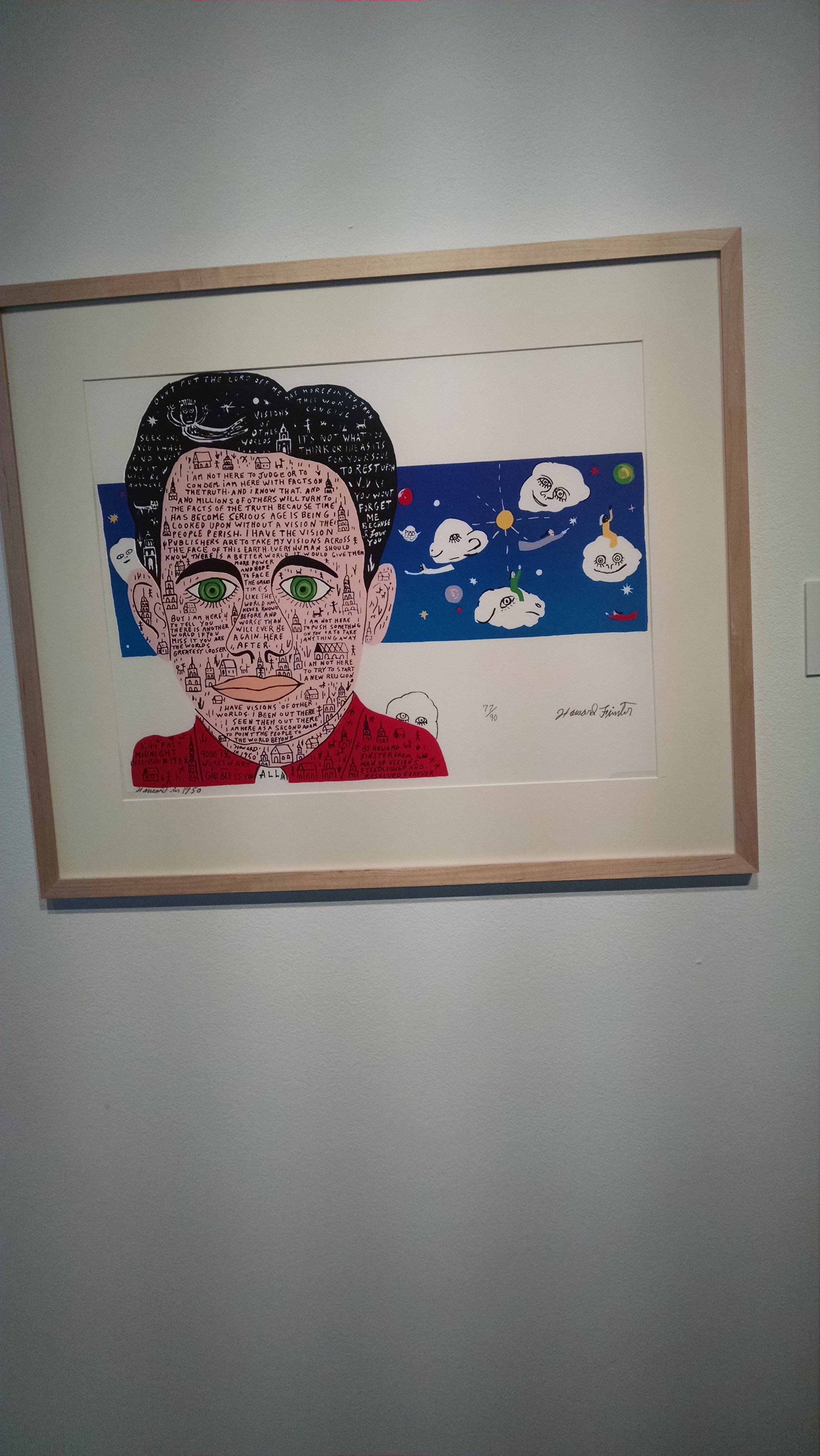
Howard in 1950 by Howard Finster is one I also believe to be rhetorical as it displays a subject that could be contradictory for viewers. The words on the mans face speak of visions of another world. This goes into social rhetoric and provoking a change in the society and world that we live in. He is using his artwork to tell his audience that things need to change in this world and something must be done. I believe that this is something hugely rhetorical because the artwork is something that is directed at such a specific audience as those who also believe in this change in the world.

In conclusion looking at these two images, my opinion remains the same that art is something that can be hugely rhetorical. The artists choose to paint or use whatever medium to make their art something that portrays a message to their audience. It is about how the audience perceives this images and what they take from them that makes the art something that is rhetorical.

post #3: Reflections on the Humanities

I really enjoyed the piece by Edmundson titled “The Ideal English Major” because I agreed with a lot of the points that he was making. The main overarching point of English being a major that makes a person grow and change through the works they are reading was really relevant for me. I agree that English majors always seem to be changing who they are as a person. I find myself changing my views and opinions and being more open to others’ opinions because I am so used to doing this with my major and being open to books and different ideas that others have. It’s always nice to read something and figure out something that I would’ve never thought about had I not encountered that information.

The article titles “Humanities Past, Present- and Future” was very interesting for me and I found myself relating to it a lot as well. Edmundson said that he believed the humanities were more than just books, but also experience. I saw this as something that I can find true for myself with my studies and in life as well. I think that it is always more than just what you are reading in a book, in order to fully understand something I think it is important to experience it in many different ways and maybe even in all aspects of life. Humanities should be something that make us want to provoke change in the world, and after all, isn’t that what most people want to do anyways?

Edmundson tells us in his articles that we need rhetoric. We need it to promote change in the world and keep the world going and improving. Though he doesn’t outright state it, what I drew from his articles is that we need to use rhetoric. Without rhetoric we won’t be able to promote and carry out those changes which we as students, professors, and just anyone want to see in the world.

Post #2: Theorizing Visual Rhetoric

Theory of Visual Rhetoric by Sonja K. Foss:

  • DEFINITIONS OF VISUAL RHETORIC
    • study of visual imagery within the discipline of rhetoric
    • strategic use of symbol
    • advertisements, television, film, architecture, interior design and dress
  • SYMBOLS FOR THE PURPOSE OF COMMUNICATING
    • symbolic action- use of arbitrary symbols to communicate
    • human intervention- human interaction in the process of creation or interpretation
    • presence of an audience-human action in some part of the visual communication process, and it is communicative in its address to an audience
    • VISUAL RHETORIC AS A PERSPECIVE
    • set of conceptual lenses through which visual images become knowable as communicative or rhetorical phenomena
      • nature of the image- presented elements and suggested elements
      • function of the image- the action the image communicates
      • evaluation of the image- features of visual images as a means to generate rhetorical theory expanded to the visual
  • DEDUCTIVE APPLICATION OF THE RHETORICAL TO THE VISUAL
    • use of visual imagery to illustrate, explain, or investigate rhetorical constructs and theories formulated from the study of discourse
  • INDUCTIVE EXPLORATION OF THE VISUAL TO GENERATE THE RHETORICAL
    • investigation of visual features to generate rhetorical theory that takes into account the distinct characteristics of the symbol


Seeing the Text by Stephen A. Bernhardt

  • Visual Rhetoric- the matching of visual design to the constraints of cognitive processing
  • graphic qualities of writing
    • white space
    • illustrations
    • typeface
    • symbols
    • graphic patterning
    • enumerative sequences
    • headings
    • schematics
    • lists
  • Law of Equilibrium- balance among items in a field
  • Law of Good Continuation- pull figures out of the background
  • Law of Closure- contrast in making out text
  • Law of Similarity- homogenous grouping of similar units

Reflection on Articles:

I personally really enjoyed reading these two articles to learn a little bit more about visual rhetoric. They helped me come to an understanding of the broad category that visual rhetoric may fall under. Visual rhetoric is not just about art and pictures, but also the layout and design of many different documents. The terms introduced in these articles helped me to see that visual rhetoric can be studied by multiple perspectives instead of just from the audience.

Post #1: Personal Introduction

My name is Jessica Groff and I am a senior at Longwood University. I will be graduating in May and receiving my degree in English with a concentration in Rhetoric and Professional Writing and a minor in Children’s Literature.

The purpose of my blog is to share my learning and ideas from my class ENGL 303: Visual Rhetoric and Document Design. My intended audience is primarily my professor and classmates, but my posts will also be for anyone who happens to stumble upon my blog and continue reading.

I am taking this class because it is required of my concentration, but I am also excited to learn more about the visual aspects of rhetoric and to add onto my previous knowledge with my rhetoric and professional writing coursework!