
Changing the Letter Assignment
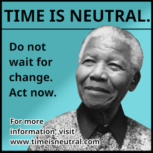
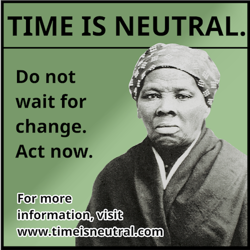
Recreating Martin Luther King Jr.’s “Letter from Birmingham Jail” as a line of advertisements emphasized the importance of word choice and the meaning of images. Since advertisements are so small, each word had to matter. I chose to reuse the “time is neutral” segment, because it is a powerful set of words, and it conveys a serious message in a short period of time. It also draws the viewer’s attention and curiosity, since it is somewhat ambiguous, leading them to want to learn more as it suggests. In regards to image, I learned an important lesson about unknown connotations. I was originally going to use Mahatma Gandhi, but during a critique I was told he actually had some views that opposed Dr. King’s. Because of this, he wasn’t necessarily the best choice, which proves that it’s important to go beyond initial knowledge in regards to the message an advertisement is sending. I chose to use a variety of historical figures, represented here by the examples of Harriet Tubman and Nelson Mandela, as a way to reach a wide audience. I believe this was one of the more successful aspects of my project. I also learned that genres as a whole have specific strengths and weaknesses. For example, advertisements are efficient by conveying information in a small space, but people have an inherent dislike for them, so they may be ignored. I had to consider the pros and cons before choosing a genre, but ultimately landed on this one despite the drawbacks.
Infographic Assignment
Researching and creating a unique infographic taught me the importance of data management and the importance of simplicity in design. I originally had a lot of research, so I needed to narrow it down to only the most relevant, which ended up being four major topics. Despite having a lot of extra research, I only used some of it to convey my message. In regards to design, I found out that simplicity is best. By making the designs as simple, yet appealing, as possible, the audience’s interest can be held and everything stays readable. I wanted to use something relevant to my topic (bees), so I chose to do a honeycomb design, which was a simple but interesting way to represent percentages. I also learned the importance of labelling; initially, some important data like years, units, and explanations for specific terminology were left out. By adding these in, I made the information clearer to the viewer. Another important lesson was the use of color. At first, I chose green to represent nature. During the critique, it was suggested that I changed the theme to a honey-like color. By doing so, I made it so the infographic continually draws attention to a reason why we should be preserving bees– honey.